Is 3D Touch a gimmick?
The current fierce competition in the mobile device market has made it a pretty exciting time to be a mindless consumer drone. As designers and manufacturers race to ape one another’s latest features, their users tend to benefit, regardless of the platform they’re tied to. But in the past few years, Apple’s innovation has seemingly slowed down. Being an Android user, it’s bittersweet for me. It’s always fun to gloat when the country’s most valuable company borrows a feature you’ve been using for years, but I still hold out hope for another quantum leap that will bring the whole industry forward.
That’s why I was excited about the 3D Touch feature on the new iPhones. You can tap the screen with more or less force than usual to take different actions. It’s not just technically impressive – it could enable an entirely new set of interactions with our devices. It could even be a big step toward unlocking the full potential of digital interactions hinted at in Bret Victor’s great rant on interaction design. I was really excited to try it out (and even more excited for it to inevitably trickle down to Android). But after seeing it in use, and in my short experience with it, well, it’s not really doing it for me.
It’s not intuitive
Think about how the world changed when the first iPhone was announced. Before, we bumbled along in interfaces dominated by clumsy tools and strained metaphors. Then iOS’s natural user interface instantly became the mainstream. It wasn’t just a touchscreen on a computer; it was a whole suite of interactions that mimicked the way the real world worked, making for an effortless learning curve. You pushed buttons by pushing them, you dragged things by dragging them, you stretched things by stretching them. The interface suggests these actions are possible simply by encouraging you to think of the objects on screen as things. It’s no wonder the whole world rushed to adopt similar principles – they’re grounded in our everyday interactions with physical space.
So how did the same Apple create the 3D Touch we have now? There’s nothing in the interface that suggests that such an action is possible, so a user has to go looking for it. Worse, once it happens, there’s nothing that connects the result to the force of your push. This could make it more difficult to learn how to use the feature. I’d guess that something as simple as a glowing icon or a subtle vibration could be enough to reinforce the connection between the user’s action and the outcome. My Moto X’s quick capture feature, for instance, uses a vibration that fades in to bridge the gap between the gesture and the camera opening, making the relationship between cause and effect obvious.
Of course, a determined user will overcome this hurdle. I hear that once users get the hang of it, they find themselves force-touching everywhere, even in apps that don’t yet support it. But using 3D Touch ideally wouldn’t be such a guess-and-check process.
It doesn’t do much
Setting aside the implementation, what new abilities does 3D Touch enable? Can a user do anything he couldn’t before? Sort of. So far, its use seems limited to placing shortcuts within app icons on the home screen and letting users quickly “peek” inside of messages without actually opening them. It’s true that these features are new to iOS users. But they’ve been common in other platforms for a long time.
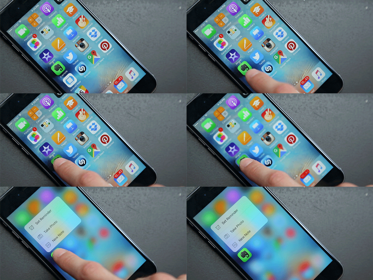
Let’s look at home screen shortcuts. Using a little more oomph when you tap an app icon can bring up a menu of quick actions you can take. Here’s an animation ripped off from the Gizmodo article I linked above, showing some Evernote shortcuts:
Great! Cool! Only there are much simpler ways to do this. Plenty of devices have support for customizable “widgets” that live on your desktop or home screen and provide easy access to information or actions. Android’s had them since version 1.0 way back in 2008. Even Apple’s been using them for a decade in OS X’s Dashboard. Here’s how Evernote shortcuts look on my Android home screen:
It’s the same quick access to the app’s otherwise buried features, only this time they’re available at a single tap. Plus, I can tap the little cog to choose which shortcuts are in the widget. To my knowledge, there aren’t any apps yet that let you choose which 3D Touch shortcuts they display. Granted, this may not be the most thrilling way to take a note. But it’s fast, and it’s obvious how to use it.
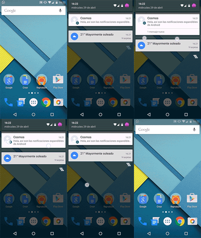
Peeking into a message isn’t much different. Android’s notification tray has long allowed users to expand items to get a peek at their contents, using pinch-zoom or a little tug. Here’s a GIF I found:
Android subtly suggests this is possible through the use of virtual “cards” for its notifications, expanding the first item in the tray by default and offering more than one way to expand or collapse. This encourages users to experiment and figure out which cards have this ability. Again, I’m not saying this is the same as 3D Touch, but it does accomplish mostly the same end in a much more intuitive way.
In all honesty, I hope time proves me wrong. I hope 3D Touch becomes an essential iOS feature. I could see it making a tremendous impact for games – just think of all the times you’ve mashed a controller extra hard, hoping in the moment that it’d give you an edge. And beyond that, I hope it stimulates the whole consumer electronics ecosystem to adopt newer and more interesting ways of interacting with computers. But it’s not there yet. Sure, it’s innovative, but it’s still an unnecessarily complex solution to a problem most interfaces have already solved. 3D Touch is not my longed-for quantum leap, but I hope it’s a baby step.


