“Is that the Apple Watch?” Three Weeks with the Moto 360
I was just starting to take Google Glass seriously back in March when Google released their video announcing Android Wear. Suddenly notifications popping directly into my face didn’t seem so appealing – the wrist was a much more natural and, in hindsight, obvious place for them. So as soon as the Moto 360 became available for preorder, I jumped at the chance to own one.
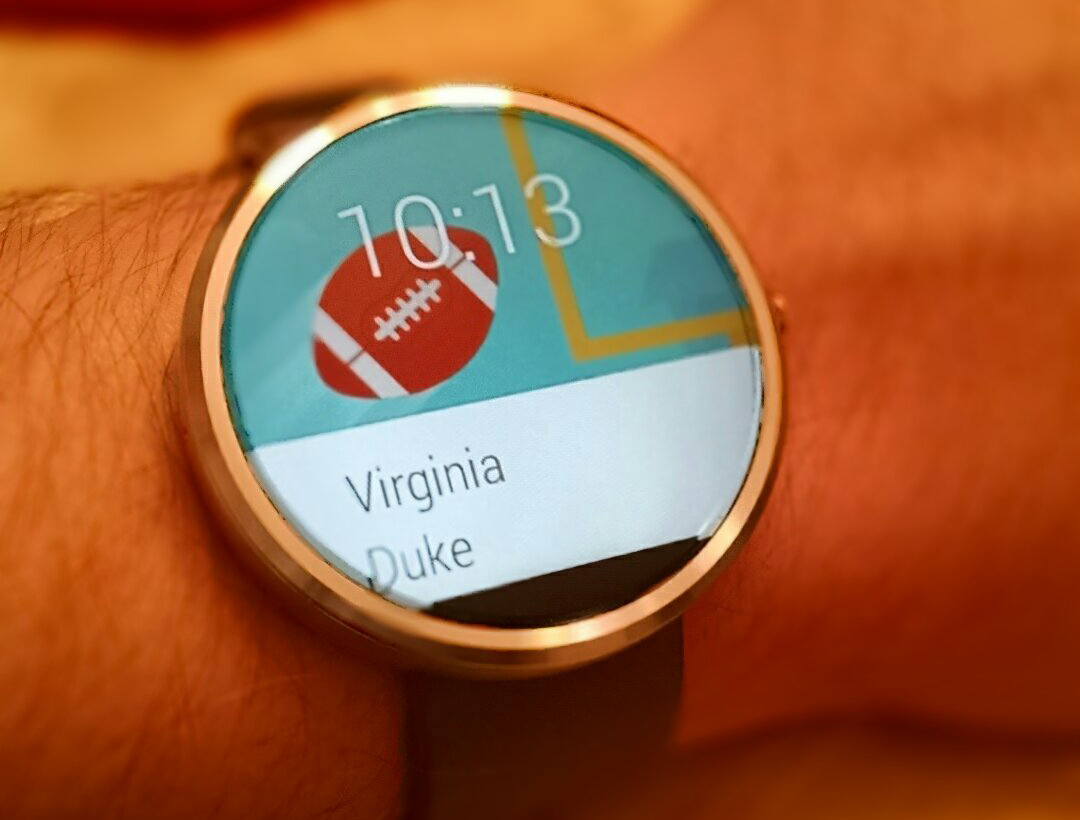
Moto 360 with Simple face
Android Wear is easy to describe – notifications on your wrist! – but its value is hard to quantify. iPhone users in particular seem skeptical when I put it that way; they’re usually more impressed by the content of the Google Now cards, which are old hat to me by now. But even among those used to Android’s powerful notifications, it’s not easy to convey how great it is to have Now’s info cards and voice controls so readily accessible. I’ve been enjoying my Moto X’x always-on voice recognition for nearly a year, but the watch experience takes it to the next level.
The 360’s round display is what sets it apart, and I’d planned to use a classic analog face. But with notification cards almost always on screen, my eyes jump straight to the text. I’d often look away from my watch only to realize I didn’t actually notice what time it was. Since that realization, I’ve been using the “Simple” watchface, which shows a digital display and lets the top card’s art show through as a background. I’ve also played with making custom faces in Facer, and I’m eager to see what else can be done once an official watchface API is released.
There aren’t many Wear-enabled apps yet, but a few are already notable. Controlling the music on my Chromecast with my watch is the coolest, and already I wonder how I ever packed for a vacation or made it through a shopping trip without having Keep checklists on my wrist. It can be clunky pulling them up on the small screen, though. Evernote for Android Wear solves this problem by temporarily showing the note you were viewing on your phone once you put it away. And Decidr goes native really well, so it’s usually what I pull up when folks ask about dedicated Wear apps.
The key to pulling off a limited-interaction interface like Wear is context: showing the right thing at the right time to avoid fumbling with swipes and voice. Done right, it’s seamless and delightful, like when your phone’s camera app is open and a remote shutter option unobtrusively appears on the watch. But there are still quirks to work out. With navigation, for instance, the watch shows upcoming directions, vibrating once when a turn is approaching and twice when it’s arrived. I like this more than my phone’s spoken instructions, but if you mute the phone, the watch stops vibrating. And if you “mute” navigation from the watch, it stops showing directions completely, even on later trips. Getting it back requires some digging around in the Wear phone app’s settings.
But Google Now has shown that if anyone can create great context-driven experiences, it’s Google. And even with its first-gen flaws, I was surprised by how quickly I came to depend on the Moto 360. The ease of reviewing, dismissing and acting on every little demand for your attention is really addicting. And there’s no way you can miss calls or texts when it’s your watch vibrating; I’ve let Wear automatically silence my phone when the 360 is connected. That said, it’s not so useful that it will change your life completely the way your first smartphone did. Until developers can master context and come up with some game-changing apps, it’ll remain a luxury item.