How I design.
When I set up this blog, I didn’t think too hard about what I could write about. “I’m a pretty interesting guy,” I told myself, “and a decent writer to boot. I’ll just write about the stuff I like to do.” I suppose my life isn’t the thrill ride I imagined it to be: the last substantial post I wrote was almost two and a half years ago. In that time, this website’s layout has gone through two major redesigns. Apparently, I enjoy the design process; I might as well write about that. Now, I don’t design professionally, and this process is more “what happens” than “how it should happen.” There was no thought on the best way to do this; I just started working, and so far this is how it’s worked for me. So there’s probably a better process out there that I haven’t found – and if you use one, drop me a line, I’d love to hear it. But when I’m designing a website, this is how I roll.
Phase 1: Sketching out the gist of it
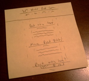
A few hours or days into thinking critically about design, both online and off, that I enjoy, I usually get an idea that carries the right balance of elements ripped off from others and unique concepts that match what I want to do. I try to sketch a quick, simple version of a this idea once I have it. Many times, I’ve tried to jump right into coding, only to realize that my layout wasn’t going to work, or that, through a dearth of planning, I’d written myself into a corner that would make the rest of the page more difficult. But with a sketch, I can see immediately if the design is going to be a disaster, and having a rough idea of the layout from the start helps me to figure out how the page is going to be structured in the end. And when I say a “rough idea,” I mean it. Usually the first sketch is just lines separating the main areas of the page, with maybe a box with a stick figure inside to represent a photo.
With a satisfactory idea sketched out, it’s time to move on to phase 2.
Phase 2: laying out a mockup
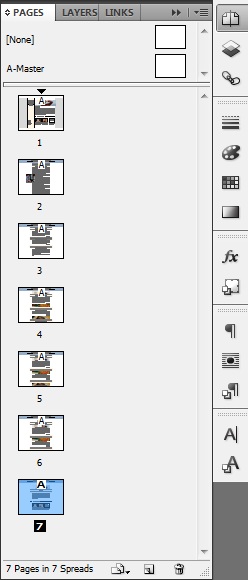
Sketch in hand, I turn to a desktop publishing program to create a mockup of the design and to get a feel for how it will work on a computer screen. Starting with a screen-shaped canvas, I’ll lay out the main areas of the page, assign background colors and define text areas, creating an abstraction not unlike the sketch itself. Then I’ll gradually add the features that make it look more like a real website: an image here, some Lorem Ipsum there. The freedom to rearrange the layout in just a few clicks is crucial to getting the proportions of and relationships between elements of the page right, so this is the stage where I try to nail those down. And I can radically change the design without losing my work just by copying everything to a new page in my document before I start hacking it apart.
This is also a great time to ask for feedback about your tender young design. Personally, I have no idea what the hell I’m doing, so I frequently export my work to PDF and show it to my most tasteful friends. Then I can quickly try out their suggestions, incorporate changes I like, and spit out another mockup for more abuse.
I like to use Adobe InDesign for this step because I have experience with it from my days working with my college newspaper’s Production department, but there’s really no reason to drop the fat stacks Adobe charges for Creative Suite. Between you and me, if I’m working on a netbook or away from my CS5 computer, I use PowerPoint. I haven’t tried it, but you could probably even use Google Docs Presentations or Drawings if you were committed to going the free route. It doesn’t matter what you use as long as you can give a website-y look to your sketch, think about it and make changes easily.
How website-y? I don’t worry too much about designing logos or textured backgrounds in this step – basically, anything I’d have to use Photoshop for. Typically the only images I include are photos that I know I want to incorporate into the design, like thumbnails for featured posts. I do try to nail down typography here, though, and will pick out two or three fonts I like and try to limit the design to those.
Enough talk! Here’s what the mockup of this website looked like by the time I was happy with it (click to enlarge):
Pretty close to the real thing! Unfortunately, it may make for a good-looking picture, but the real work doesn’t start until…
Phase 3: Coding a static mockup
This is where the rubber meets the road: turning my pretty PDF mockups into an actual HTML file. I start by carving as much as I can get away with out of old websites I’ve worked on, but that’s usually limited to a few basic CSS rules. Before long I’m forging ahead on my own.
Usually it helps me to make another sketch here, this time informed by the mockup. Now, instead of focusing on how the design elements look, I limit my drawing to simple rectangles. Then, working from the page margins inward, I start to figure out the size in pixels of each element, including its borders, margins and padding. I figure out sizes and create images in this step mostly because InDesign sizes documents in mysterious and arcane bizarro-increments like pica or, worse, decimal inches. I could set it up to work in pixels, but I haven’t bothered to figure out how yet. I’ll keep this new sketch handy as I work so that I don’t accidentally have <div>s crowding each other out. And I start coding the same way, adding empty block-level elements one or two at a time until the major sections of the page are present and fit together nicely.
I’ve read that you should create your stylesheet before touching your markup, but I don’t have the vision to accurately imagine what the styles I’m describing will look like. Instead, I’ll switch off, creating a style, then immediately trying it out and revising it. Gradually, the “markup mockup” comes to be near-identical to the InDesign file.
Next I’ll throw as much formatting as I can think of into the lorem ipsum – links, block quotes, bullets, &c. – to make sure they play nice with the layout. Then, finally, I’ll hammer out final versions of the logos, textures, and other images I need. One useful byproduct of waiting so late to knock this out is that it enforces minimalism; by this point, I’ve usually found another method to obtain the effect I desired or reconsidered its necessity.
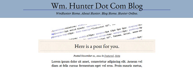
By the time this mockup is done, it should look almost, if not completely, identical to the imagined finished product. The static mockup for this WordPress theme looked like this (click through to the actual HTML file):
I typically use Notepad++ to write my code; I’ve played around with and been impressed by Handcraft, but at present I don’t do enough design work to justify buying a plan. As I work I refer frequently to W3Schools resources on HTML and CSS.
If I’m building a static website (like, my useless sister site Hunter.Tamma.ro), I stop here. But most sites today are dynamic, so I usually move on to…
Phase 4: Make a WordPress theme
Even when I’ve had to make general-purpose databases for dynamic websites, I usually fall back on a WordPress implementation. I know WP, and it’s robust enough that with a few plugins and liberal use of custom fields, it’s practically an all-purpose CMS.
The first step is always figuring out how to carve the single HTML file into header, footer, sidebar and body, then wrapping the post’s HTML in The Loop and adding all the usual WP functions. I’ll refer to the WordPress Codex when I inevitably forget how to use them. And I’ll sneak a peek back at themes I’ve worked on before to see if I’ve forgotten any entirely. (Spoiler: I always have.)
And that’s getting into the long tail of WordPress development: slogging through all the other features you can add to a website. As I code, I realize I can’t just make an index page – I need single posts, categories and more. In fact, I’m still in the thick of this phase. The website looks good and works well now, but I maintain a list of additions yet to come: comment forms, post formats and HTML5 support, to name a few. In fact, none of the themes I’ve created for this website have ever been in a state I’d call “finished.”
But I use them anyway! Waiting to perfect a design is what kept me from writing at all for two years. At some point you have to pull the trigger – and if a nitwit like me can, you can too.


